Branding
Campaigns
Marketing
Website
Design
Signage
Digital Assets
Tone of Voice
Social Media
Photography
Email Marketing
SEO
Strategy
Brochures
Brand Creation
Packaging
Press Ads
Insights
10 Min Read
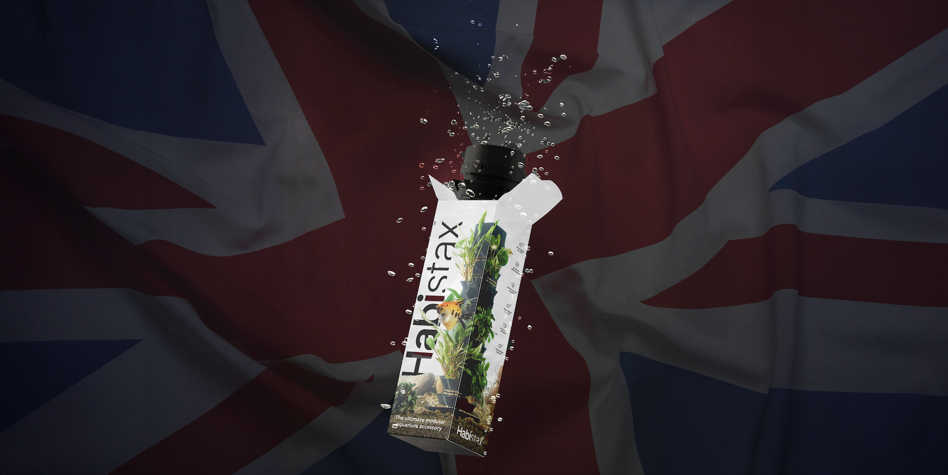
Can UK-Based Rebranding Help You Avoid Tariffs? Here’s How to Do It (Legally)
2 Min Read
Cracked the Code? Discover the Answers to Our Crossword Challenge!
4 Min Read
Why Hull-Based Businesses Need a Professional Website: Insights from Just Design Stuff 🌟
Get in touch today!
If you’re looking for a creative marketing agency, Just Design Stuff couldn’t be a better choice. Contact us today to let us know which of our services you believe will be useful in taking your brand to the next level. Whether it's boosting brand engagement and customer loyalty or building a social media presence that sticks with your customers, we are here to make sure your unique marketing needs are met with creativity and ease.
Let's get started! Simply fill in your details in the fields presented and click 'Next Step' to progress your enquiry.
Let us know what services you require?
Please select one/or several of the options presented. If you require a service that is not listed in the options then select 'other service not listed'.
Tell us about your project.
We're thrilled that you're considering reaching out. We pride ourselves on delivering tailored solutions that drive results and exceed expectations. Your vision is our priority, and we're eager to collaborate with you to make it a reality. Don't hesitate to get in touch with us today – we're just a message away and excited to start crafting your digital success story together.