HR People Hub

HR People Hub had the expertise and the ambition, but their existing branding was holding them back. Instead of standing out as the approachable, people-first alternative to traditional HR, their identity still carried the baggage of “HR = fear and formality.” They needed a full rebrand that would challenge these perceptions and position them as trusted partners who make workplaces happier, healthier, and more productive.
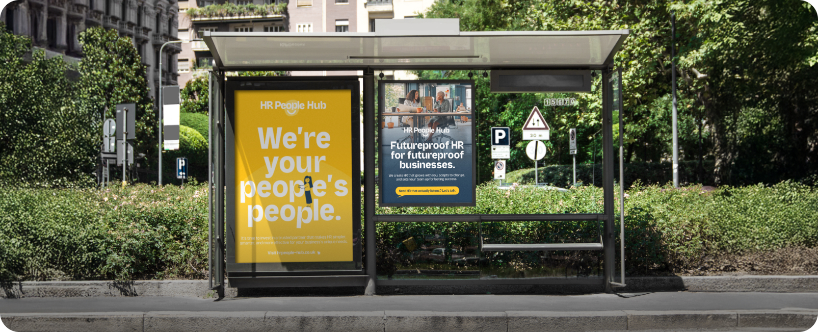
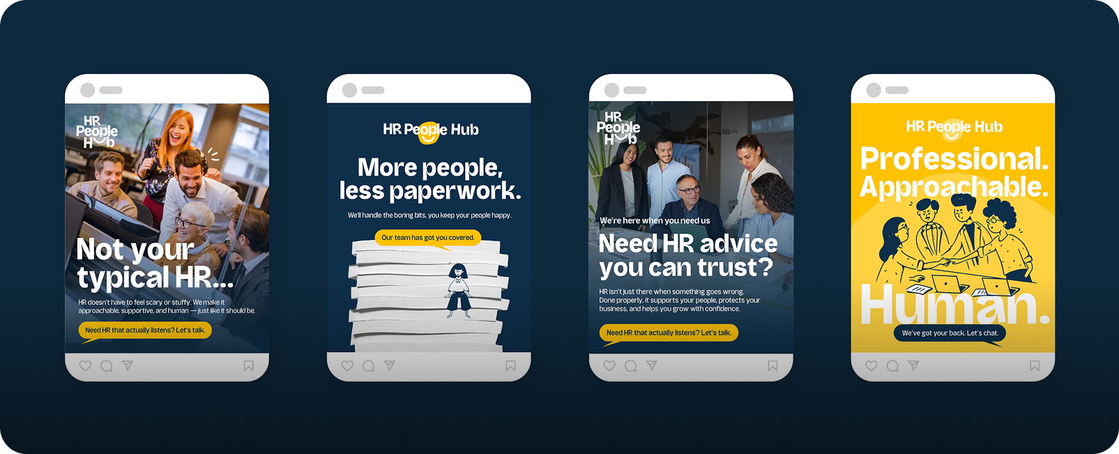
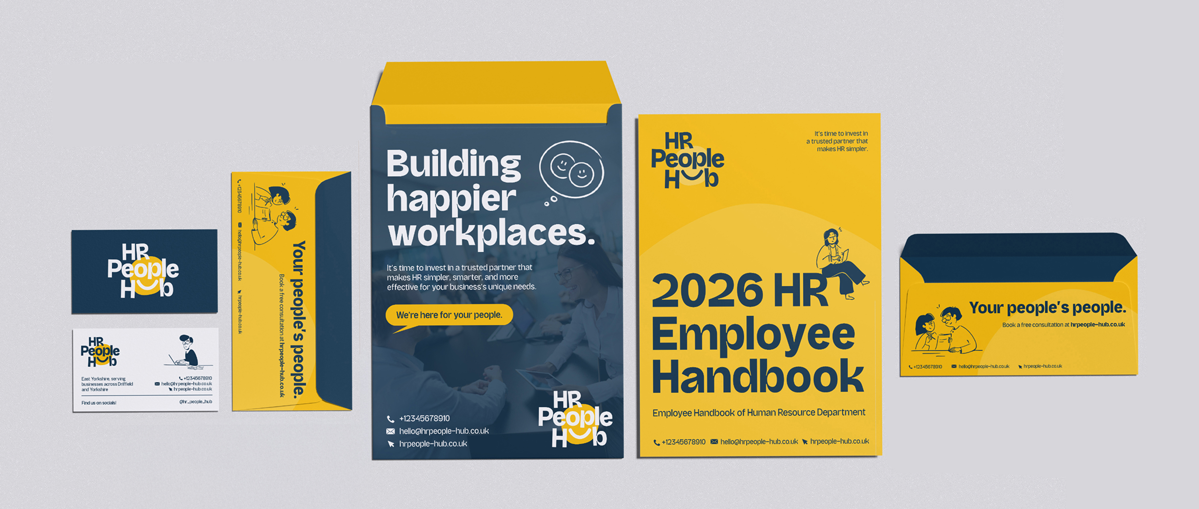
We developed a bold new identity that swapped corporate grey for vibrant colours, playful illustration, and messaging that spoke human, not HR jargon. From the logo through to digital campaigns, social content, and large-scale advertising, every element was designed to feel approachable, modern, and unmistakably different. The result was a brand that businesses wanted to engage with, because it felt like an extension of their own team rather than a box-ticking service.
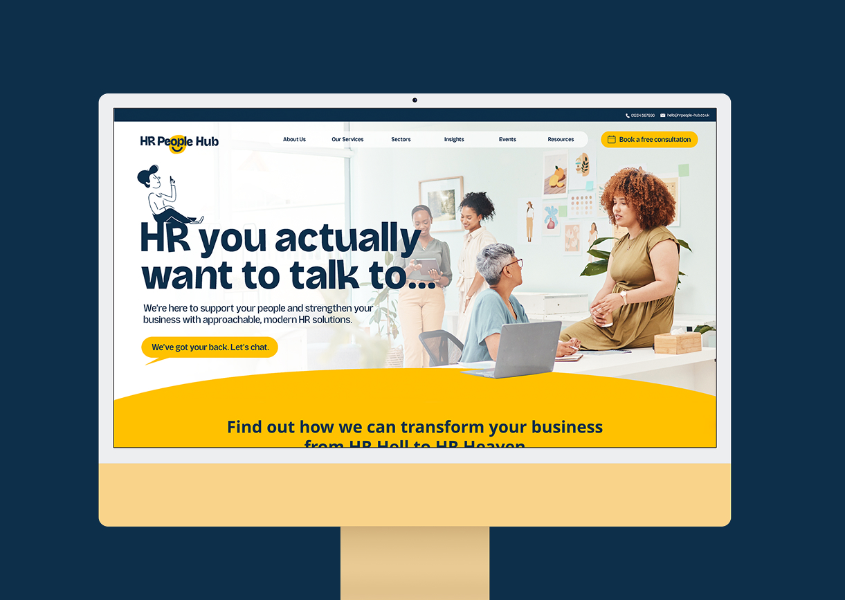
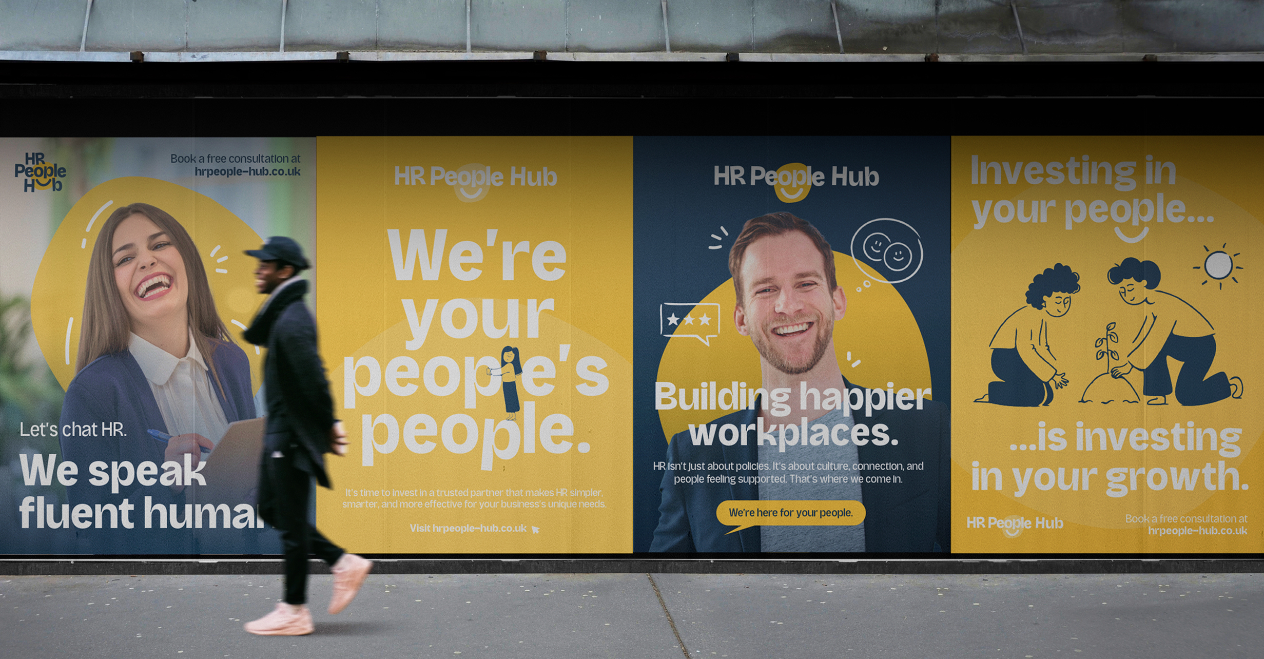
We built a full rebrand for HR People Hub, creating a bold new identity that feels vibrant, modern, and unmistakably human. The refreshed logo, colour palette, and tone of voice all work together to position them as approachable partners rather than a corporate service. Alongside this, we designed a new website with a clean, people-first focus and rolled out large-scale marketing posters that champion positivity, trust, and collaboration, showing businesses that HR can be something they actually want to engage with.
1
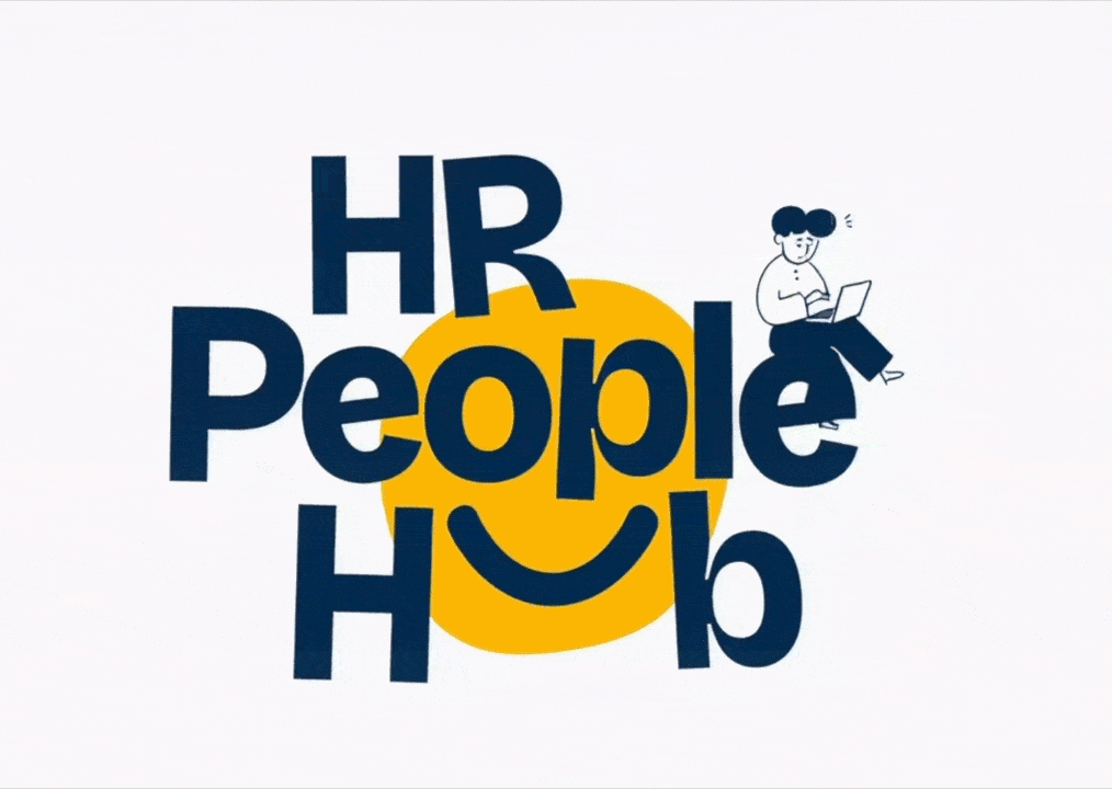
Logo Creation
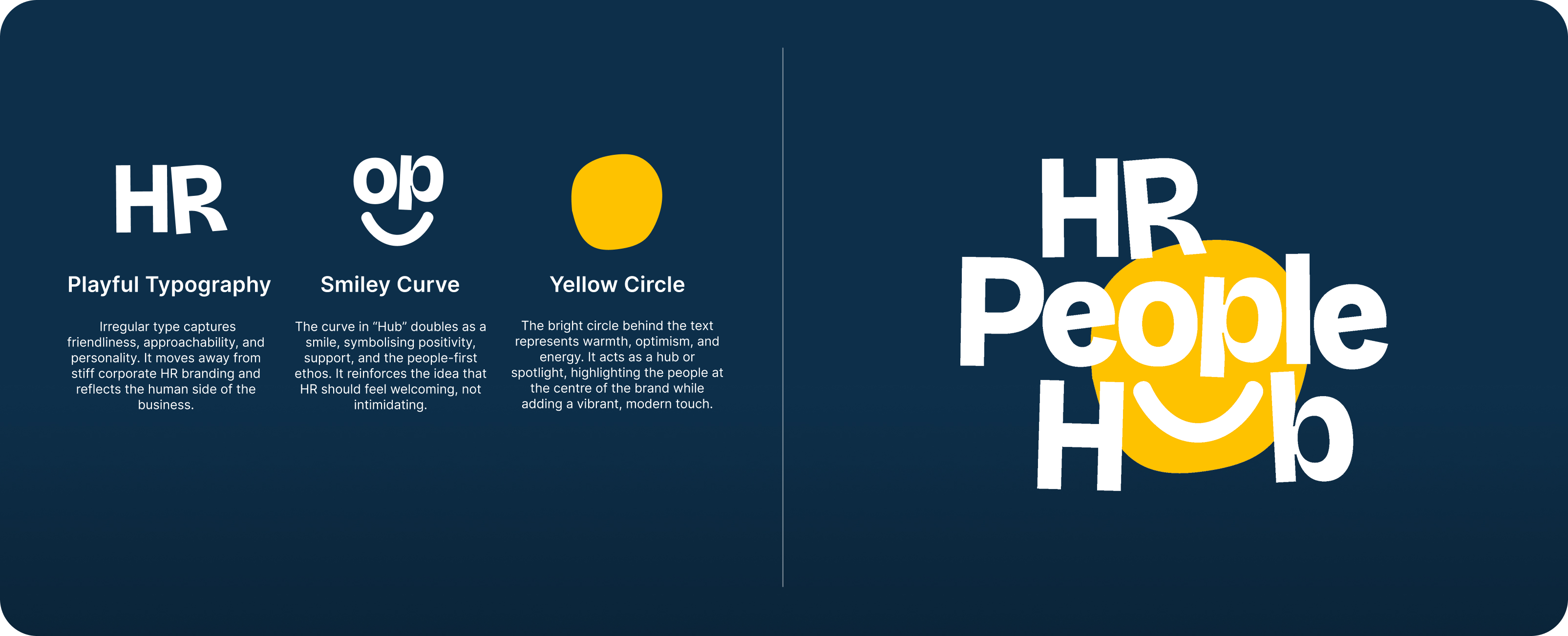
Logo Creation
2
Marketing
Marketing
3
Social Media
Social Media
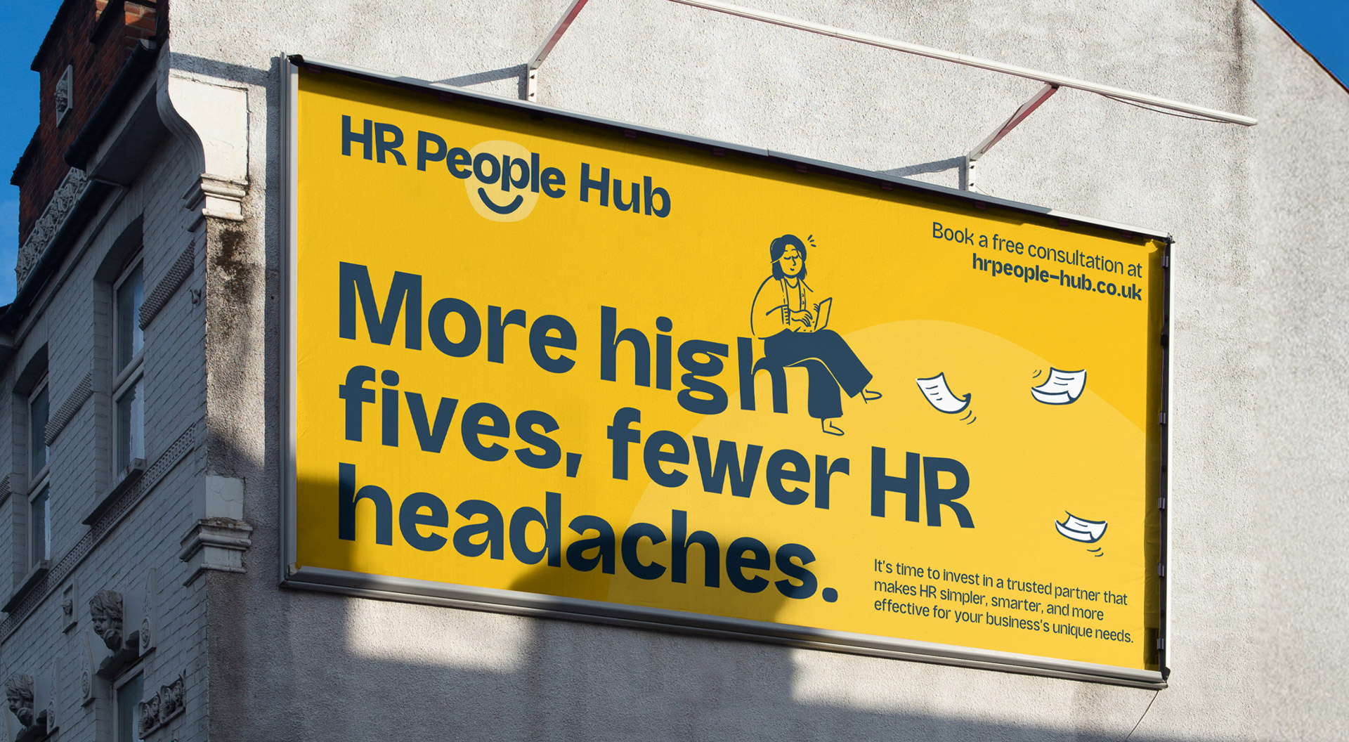
The bold use of bright yellow and deep blue became a defining feature of HR People Hub’s identity. This high-contrast palette doesn’t just grab attention in busy environments, it creates instant recognition wherever the brand appears. While most competitors rely on muted corporate tones, HR People Hub stands out with a look that feels energetic, confident, and modern. It’s a visual style designed to be unmissable, ensuring the brand message cuts through no matter the channel.

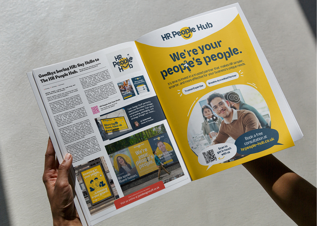
By using bold illustration and simple, human-led messaging, we created a brand style that speaks to everyone, from business leaders to everyday employees. The illustrative approach softens what can often feel like a dry, formal subject, making HR more approachable while ensuring complex ideas are communicated clearly. This balance allowed HR People Hub to engage a wider audience without losing credibility, showing that HR can be both professional and personable.


This project was all about breaking HR free from its corporate box. We loved the challenge of creating a brand that could feel bold, warm, and instantly approachable, while still carrying the credibility the sector demands. Seeing the yellow and blue cut through the noise against competitors has been one of the most rewarding parts of the process.
The Stats


The Results
The rebrand gave HR People Hub a distinctive voice in a traditionally conservative industry, helping them attract attention from businesses looking for a fresh approach to HR. The new visual style, combined with bold messaging, has improved recognition across social, outdoor, and digital platforms. With a clearer identity and sharper communication, HR People Hub is now positioned as the approachable, modern HR partner they set out to be.