Design
Colour Theory in Design & the Importance of Colour
Share to
Colour Theory in Design
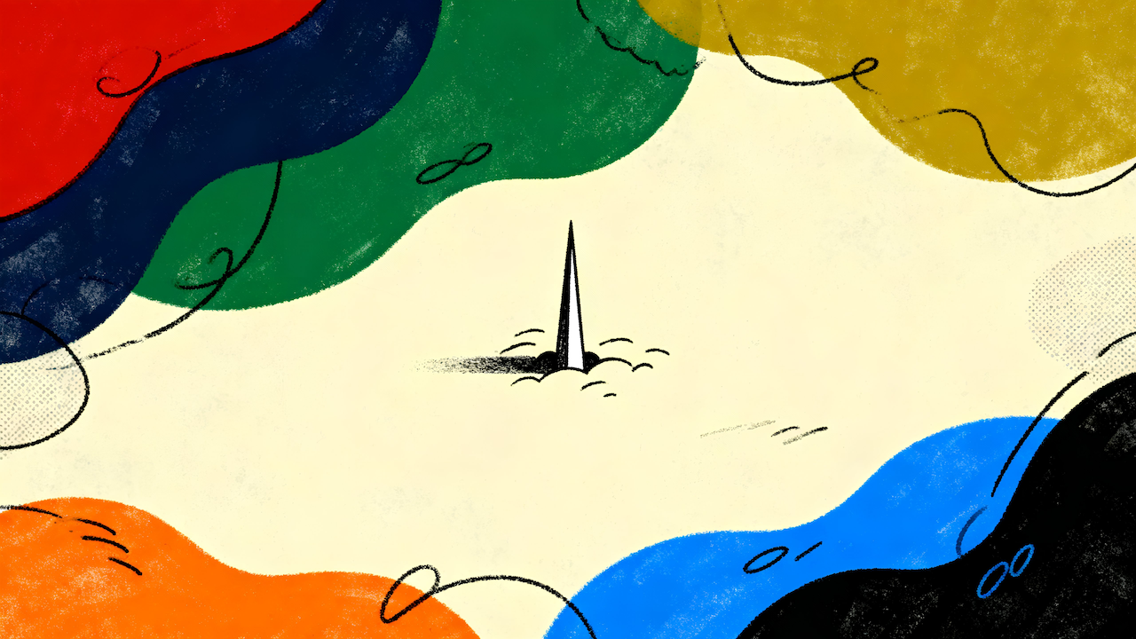
The use of colour in graphic design and content is essential to creating the right visual impact. From eye-catching logos to statement-making website designs, the strategic selection of hues can have a considerable effect. But how do you know what colours work together? This article dives into the world of colour theory and how understanding it can help you make informed decisions about your next design project.
Overview of Colour Theory
In design, colour theory is the study of how colours interact with one another. It includes studying light and pigment, as well as the psychological effects of colour. Colour theory is an essential part of any designer’s toolkit, as it can help to create harmonious colour schemes and avoid clashing colours.
There are a few key terms that are often used in colour theory:
Hue: This refers to the purest form of a colour, without any added tints or shades.
Tint: This is when white is added to a hue, lightening it.
Shade: This is when black is added to a hue, darkening it.
Value: This refers to the brightness or darkness of a colour. A colour with a high value will be very light, while a colour with a low value will be very dark.
Saturation: This refers to the intensity or purity of a colour. A highly saturated colour will be very vibrant, while a less saturated one will be more muted.
Primary, Secondary and Tertiary colours
There are three different categories that colours can be placed into. These categories are primary, secondary and tertiary colours. All other colours are derived from these three groups.
Primary colours are the most basic and cannot be made by mixing any other colours together. The three primary colours are red, yellow and blue. Any design that uses only these three colours will have a basic look.
Secondary colours are made by mixing two primary colours together. The three secondary colours are orange (made by mixing red and yellow), green (made by mixing blue and yellow) and purple (made by mixing red and blue). A design that uses only secondary colours will have a more complex look than one that uses only primary colours.
Tertiary colours are made by mixing a primary colour with a secondary one. There are six tertiary colours: red-orange, yellow-orange, yellow-green, blue-green, blue-purple and red-purple. A design that uses tertiary colours will have a complex look, as there is a lot of variety within the colour palette.

Warm and Cool Colours
When choosing colours for your design project, it’s essential to understand the different effects that warm and cool colours can have. For example, warm colours are more energising and exciting, while cool colours are more calming and relaxing.
The best way to decide which colours to use is to think about the overall tone you want to create. For example, are you looking for a design that feels warm and inviting or more sleek and modern? Once you’ve decided on the overall feel, you can start picking out individual colours to help achieve that goal.
Warm colours like red, orange and yellow are often used to create an energetic or exciting feeling. These are great colours to use if you want your design to feel warm and inviting. They can also make a space feel smaller and more intimate.
Cool colours like blue, green, and purple are ideal for creating a calm and relaxing atmosphere. These are great colours to use if you’re going for a more modern look. They can also help make a room appear larger and more spacious.
The Psychology of Colour in Design
The psychological effects of colour are well-documented and can be harnessed in design to create specific desired outcomes. For example, colours can evoke certain emotions and associations and can be used to create a desired atmosphere or mood.
Specific colours are known to have calming or relaxing effects, while others are stimulating and energising. For example, warm colours such as red, orange and yellow are associated with excitement, while cool colours like blue and green are more calming.
Colour can also create a sense of depth or distance – warm colours appear closer than cool colours, while dark colours appear further away than light colours.
By understanding the psychology of colour, designers can use it to their advantage to create designs that provoke the desired response in viewers.
Different Colours for Different Mediums
Depending on the medium, different colours have different meanings and can create other effects. For example, blue often represents calmness and serenity, while red is associated with energy and passion. Green is often used to describe nature and growth, while black can be used to create a sense of mystery or drama.
When choosing colours for your design project, consider what message you want to communicate and what feeling you wish to evoke. Then, select the colours that will best help you achieve your goal.

Conclusion
In conclusion, colour theory is a powerful tool for any designer. It can help you create visually pleasing designs that capture the right message and mood. Colour theory can create sophisticated palettes, determine how colours interact with one another, and communicate without words. Understanding its principles will give you an edge over your competition and make it easier to craft beautiful designs that stand out from the crowd.